

141. How To Introduce Color Into Your Wardrobe - Spring Edition
A runway-to-real-life guide to color you'll wear, not just admire.

It’s odd to write about color at a time when Carolyn Bessette’s stone-and-ink palette is taking over the collective consciousness. This newsletter is marked safe from the CBK craze. For now. Instead, my inspiration this week came from a Note (I wish I remembered its author) that said, ‘my weather app and shopping cart are telling two different stories’. If you’re shopping for your spring wardrobe right now, you’ve got the right idea; the good stuff hasn’t sold out yet, and there’s time to get excited about where and how you’ll wear it. The alternative is buying winter pieces you’ll pack up in two months. (I wrote about what to shop when to optimise your shopping budget here).
At a time when cold-weather clothes are starting to wear us down, the vibrant looks seen on the runway in October are arriving in stores. Spring collections often feel fresh and optimistic, compared to the duller Fall collections, which comes down to one thing: color. I’ve enjoyed rediscovering Kallmeyer’s duck-egg blue and Maria McManus’ soft lilacs and candy-floss pinks. Our visual system is wired to lock in on color, and color boosts perceived pleasantness compared to grayscale images.
However.
Color on the runway (and on social media) doesn’t always translate in real life. In today’s newsletter, I go through the colors you’ll find in stores this season and show you how to interpret them in ways that are actually wearable. It’s an invitation to experiment with color, and I’m sharing tricks for styling it that I have never shared before.
Before the specifics, the broader principles:
If you want to wear more colors, get yourself a pocket color wheel. It’ll cost you $2 from your local art-and-crafts shop or from you-know-where. It’s a handy display of hues (another word for color), tints (color + white), tones (color + gray), and shades (color + black).
What makes this a great tool for getting dressed is that it shows analogous and complementary colors. It will help you combine colors based on intention:
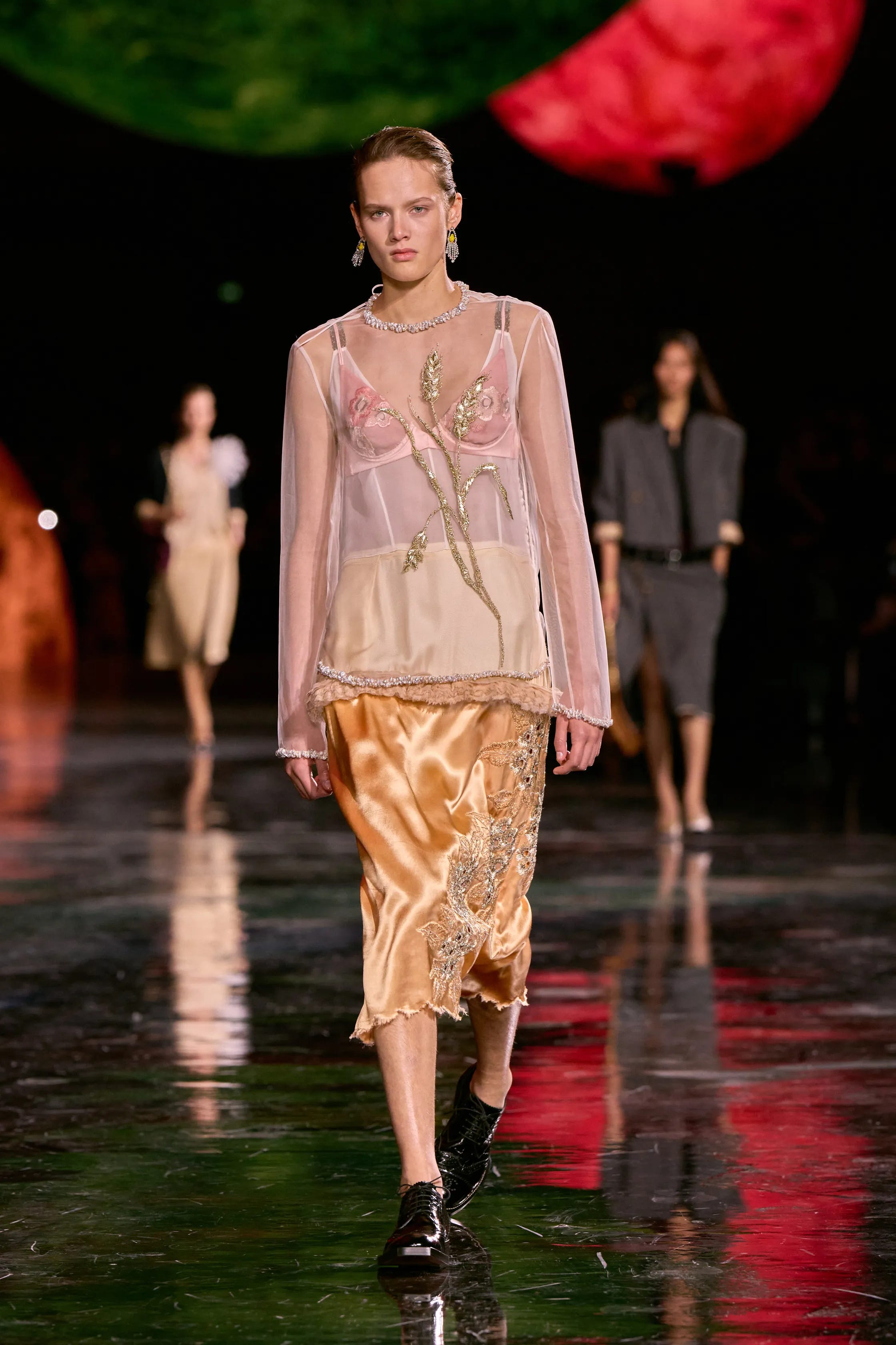
Analogous colors make calm, sophisticated looks. The powder rose and dirty peach colors from look 4 of the Chanel Spring 2026 runway are next to each other on the color wheel.
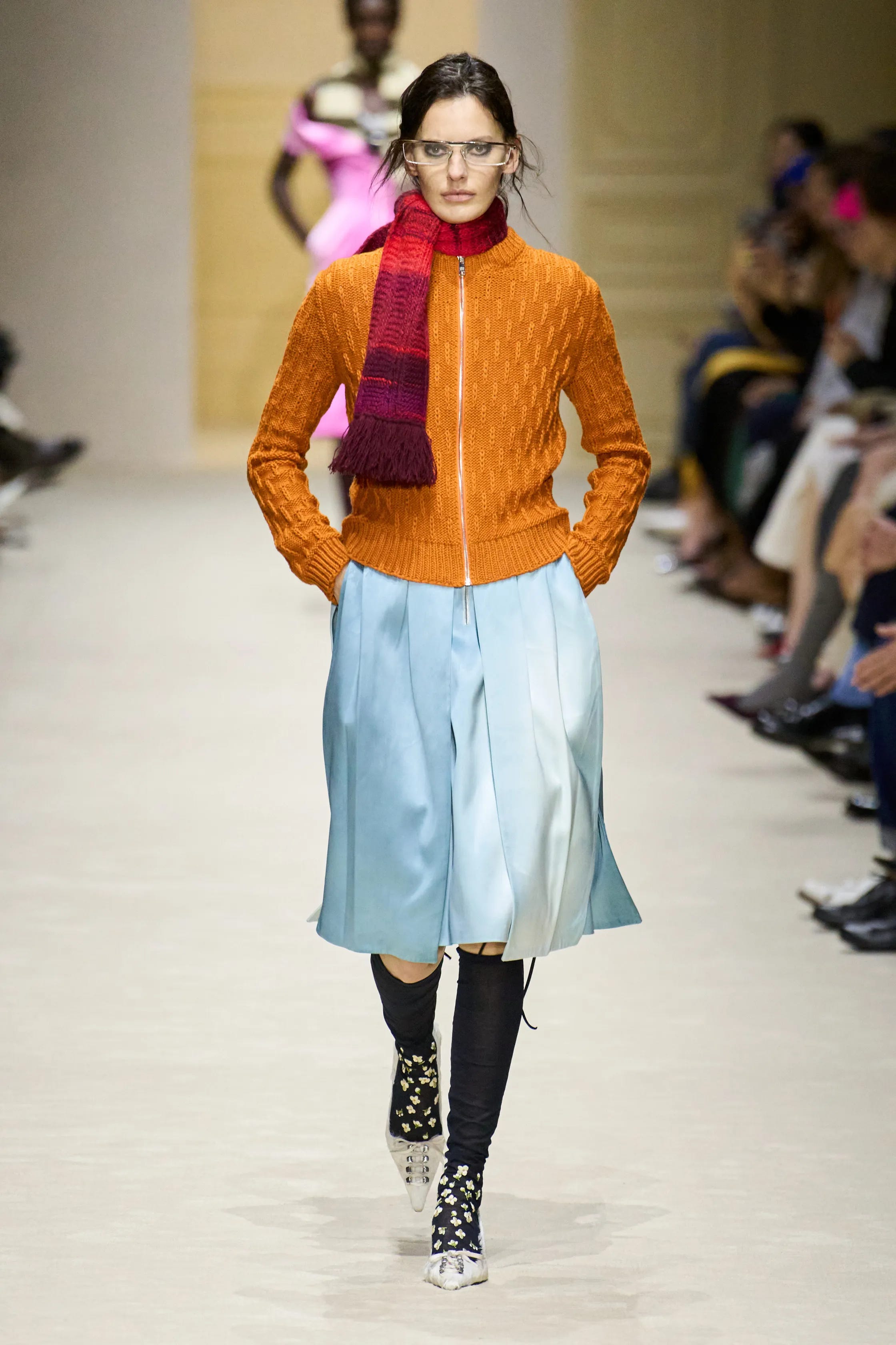
Complementary colors create bold, contrasting looks that draw all eyes to you while remaining harmonious. The glacier blue and tangerine orange from look 28 of this week’s Prada Autumn 2026 show are opposite each other on the color wheel.
Although a fan of seasonal color analysis (I wrote about it here and here), I don’t think of color styling as a science. It’s deeply personal and relative. Josef Albers, a German artist who was Yale’s Head of Design in the 1950s, spent his life studying the interaction of color. He said, “In visual perception, a color is almost never seen as it really is—as it physically is. This fact makes color the most relative medium in art.” Here’s a short video that illustrates how a color can look completely different depending on the color it’s displayed against. How this relates to personal styling is that emulating a colorful outfit you see on the runway or worn by an influencer is not that straightforward. That could explain why the bright red sweater you bought last fall didn’t land as you hoped it would.
Styling color is tricky. Styling colors together is trickier. Styling highly saturated colors is the trickiest. With experimentation, you’ll get to know your parameters. I would, for example, NEVER wear bright colors near my face or try to emulate outfits like Brooke Callahan’s below. I would look like a child’s nursery homework assignment. I limit my appreciation of primary colors (blue, yellow, and red) to Piet Mondrian.
Now, let’s dive in.
